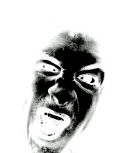
Here shown is one version of my final poster. Then after my background was complete I added a car to the poster which was distorted some. After that I began to add the location and other necessary elements like that to make the poster appear as if it were for a real event.
However, I was not yet satisfied with my poster. I felt like there was to much empty space on the left of the poster so I came up with an amazing idea of adding a picture of a tire that I would alter to fit my poster. This is my poster with the tire added. Also before the tire was added I had a paper copy of my poster made so that I could actually see how everything looked on the page. What I found out was that my words were being lost because the shadow behind them was to dark. To fix that I just add a white shadow behind the letters. That fixed it.


